Stop trial and error. Stop fighting alignment. A complete practical guide for frontend developers who want to master CSS Grid & Flexbox, build clean responsive components, and code with absolute confidence.
CSS layout should not feel like trial and error. Stacking display: flex or guessing grid-template-columns causes broken mobile views and endless alignment bugs. This guide replaces guesswork with structured architectural mental models.
Learning CSS layout shouldn't feel confusing.
Most developers waste hours trying to fix alignment issues, responsive bugs, and layouts that break unexpectedly on different screen sizes.
This guide simplifies everything into practical lessons and real examples so you can build layouts faster and with absolute confidence.
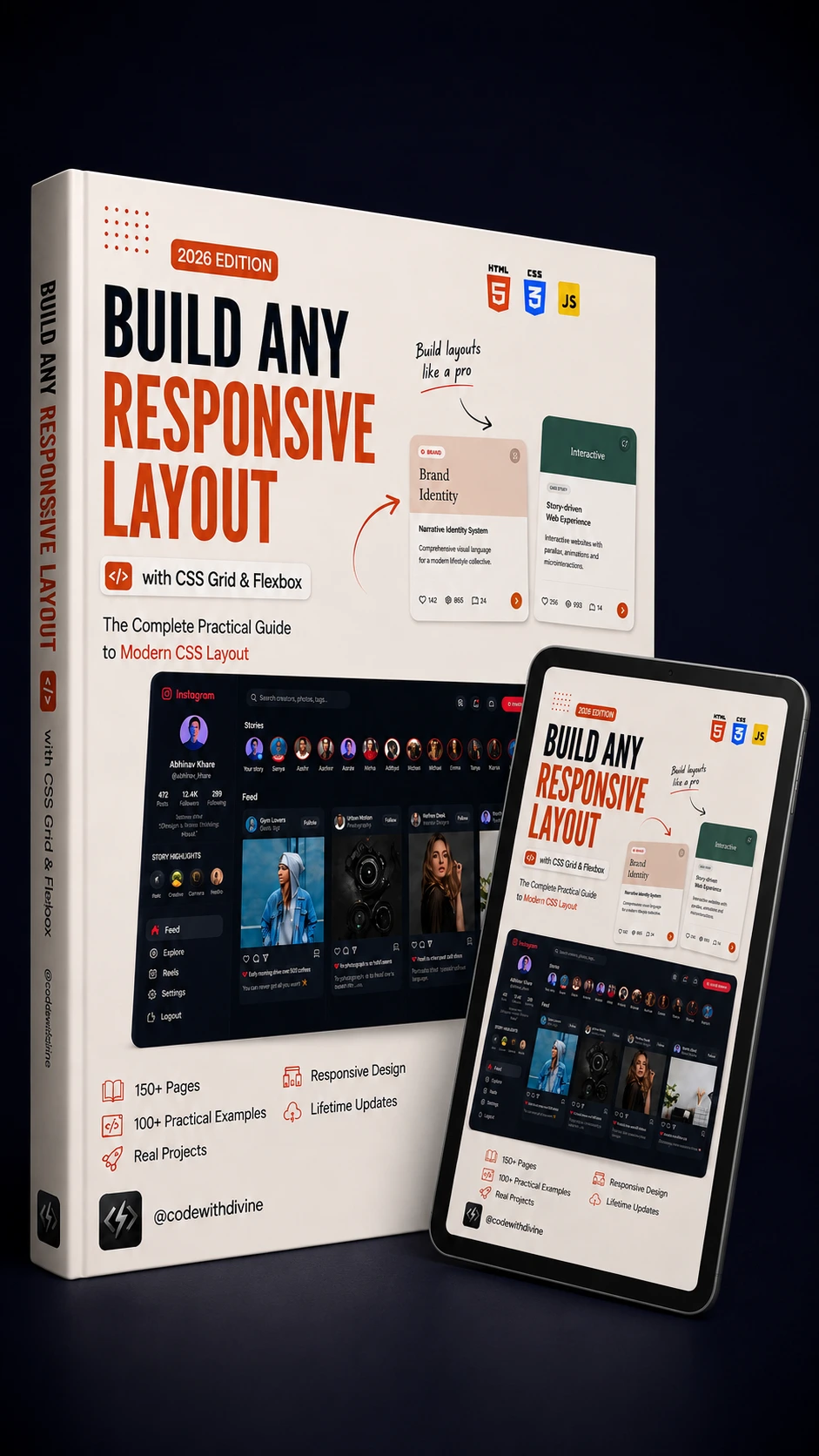
Step-by-step explanations of CSS Grid & Flexbox mechanics, taking you from foundational alignment to advanced responsive layouts.
Modern responsive layout techniques that automatically stretch, wrap, and adapt seamlessly across all viewports.
Practical code snippets you can reuse directly in your web applications and client projects to save engineering time.
Master grid tracks, flexible directions, responsive wrapping, auto-fit algorithms, and zero-break layouts across all viewports.
No abstract math. Learn layout rules with real-world website sections like Instagram feeds, dashboard views, and brand identity cards.
Learn when to use Grid vs Flexbox with a clear decision engine so you never struggle with choosing the right CSS property.
Build layouts that automatically adapt seamlessly from tiny mobile viewports to ultra-wide desktop displays without ugly media query bloat.
Build complex dashboards, dynamic landing pages, and responsive components 3x faster with reusable layout patterns.
After finishing this guide, you'll know how to:
Build responsive layouts completely from scratch with clean, scalable, and maintainable CSS architecture.
Know exactly when to use Grid vs Flexbox with a clear mental framework for every component layout.
Create modern website sections 3x faster without spending hours tweaking positioning and alignment.
Avoid common CSS layout mistakes like unwanted scrollbars, element overflow, and broken flex wrapping.
Build layouts that work perfectly across all screen sizes—from small mobile phones to ultra-wide desktop monitors.
Master modern CSS functions like clamp(), auto-fit, auto-fill, and fluid sizing without media query bloat.
Focus purely on functional, real-world layout techniques used in modern web development today.
Complex CSS layout concepts broken down into simple, intuitive language that anyone can understand.
Learn by building actual production layouts like Instagram grids, SaaS dashboards, and landing pages.
Clear visual diagrams that demonstrate grid tracks, flex axes, and alignment properties at a glance.
Stop guessing random CSS properties and spend your time building features instead of fighting layout bugs.
A handy reference guide you'll come back to whenever you're building websites and modern interfaces.
Accelerate your workflow with printable cheatsheets, decision frameworks, and copy-paste layout patterns crafted for instant production use.
Hi, I'm Emmanuel Elikwu (Divine), creator of CodeWithDivine.
I help developers learn HTML, CSS, and JavaScript through practical, project-based tutorials.
After teaching CSS layouts to thousands of developers on YouTube, I noticed many people struggled with the exact same problem—knowing when to use CSS Grid and when to use Flexbox.
That's why I created this guide. Instead of spending hours jumping between blog posts and videos, you'll have one practical resource that explains the concepts clearly and helps you build responsive layouts with confidence.
"Thanks Man, this was such an interesting and creative project. I really enjoyed watching the app come to life. AND I did learn a lot of flexbox, grid nuances much better. All the best!"
"Pls do more of this kind of tutorial, project based tutorials. This really helped learning grid and flexbox in real word projects, which will boost my portfolio. Thanks"
"Loved this video! You made learning fun and easy! It shows the amount of work you put into it. Cheat sheet please and thank you!"
with CSS Grid & Flexbox
Get full access to the book, downloadable code snippets, lifetime updates, and all 3 included reference cheat sheets instantly.
DOWNLOAD THE GUIDE NOW